The "how are we doing?" loop
Without a shared source of truth, everyone asks for screenshots and one-off reports. Someone pings the PM. The PM pings the person who "has the numbers." A spreadsheet gets attached. By the time it lands, the thread has six people and three different interpretations.
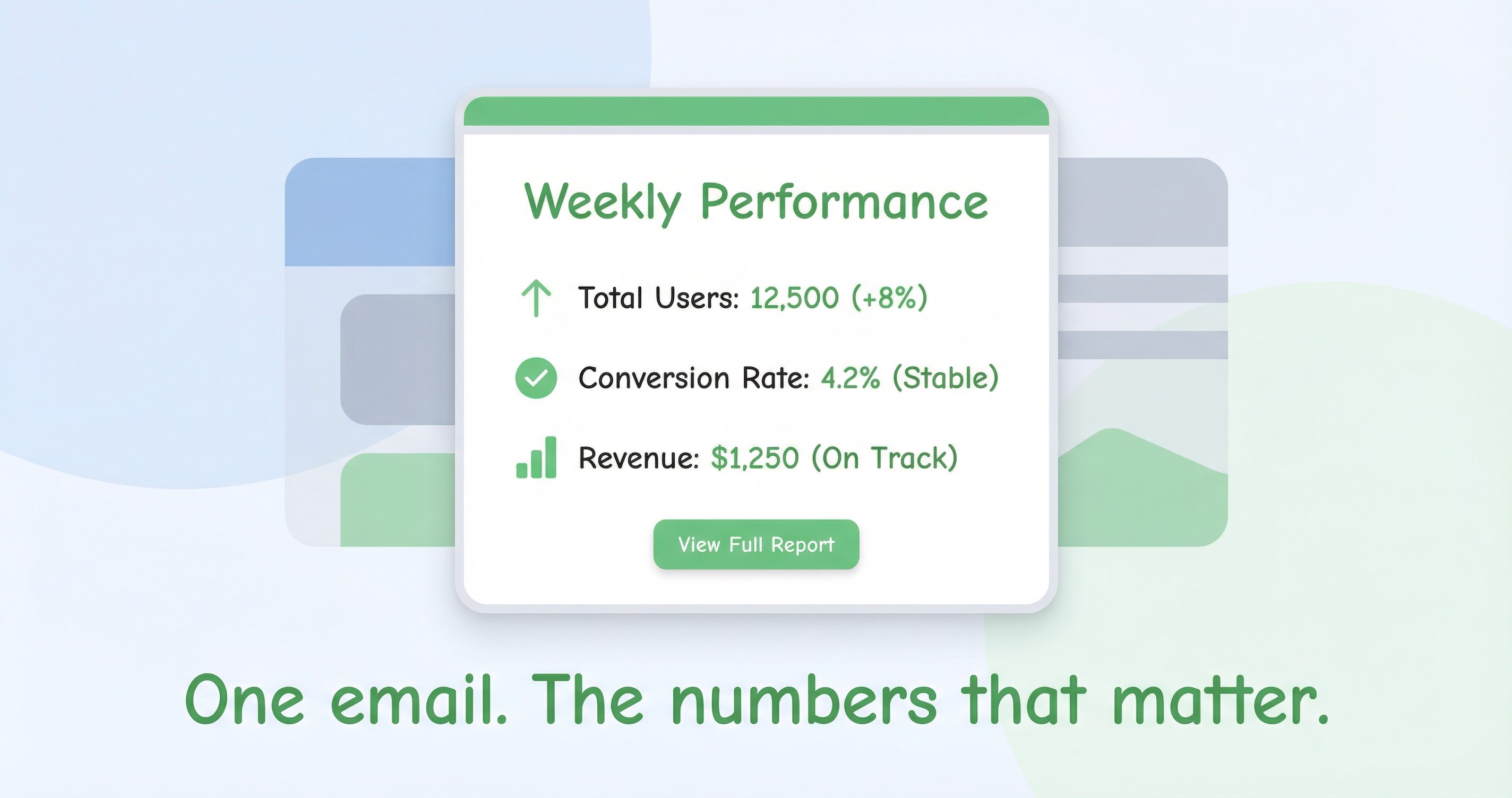
The weekly email becomes that source. One message. Same time every week. The numbers that matter. A link to the product journal so people can see what shipped or changed. No pinging. No "can you send me the retention slide?" The answer is already in your inbox.
The loop breaks because the information is predictable. The team knows when to expect it. They know where to look. They know it's the same numbers everyone else is seeing. That predictability is what turns data into a shared reality instead of a scattered set of opinions.
What belongs in the summary
The focus metric. Key changes, up or down. A link to the product journal so people can see what shipped or changed. That's it. Not every number you track. Not a novel. Not a spreadsheet.
If you have one active focus, the summary should reflect that. Here's the number. Here's how it moved. Here's what we shipped or launched that might explain it. Click through if you want the full timeline. The goal is to answer "how are we doing?" in thirty seconds. If it takes five minutes to read, you've lost people.
Some teams want two or three numbers. Fine. The principle is the same: the few numbers that support the current focus, plus enough context to know why they moved. The journal is the backup. The email is the headline.
Why email (and why once a week)
Email is low friction. Everyone has it. Nobody has to remember to open another tool. The summary lands. You read it or you don't. If you need to dig in, you click through. If you don't, you're still in the loop.
Once a week matches the cadence of "weekly metrics." Same day, same rhythm. The team gets used to it. It becomes part of the week instead of an interruption. Daily would be noise. Monthly would be too late. Weekly is the sweet spot for most product teams.
We're not against dashboards. We're against the idea that the dashboard is the only way to stay informed. Most people won't open the dashboard every day. They will glance at an email. So we put the numbers where they'll actually see them.
How we built it in AppFit
One email, same time every week. The numbers that matter for your current focus. The key changes, up or down. A link to the product journal so when someone asks "why did that move?" the answer is one click away.
You don't have to remember to check. You don't have to log in. You don't have to pull a report. The summary comes to you. If the numbers look good, you're done. If something looks off, you open AppFit and dig in. The email is the trigger. The product is there when you need it.
We built it because we got tired of "how are we doing?" threads. We wanted one place the team could look, once a week, and know the answer. That's what the weekly summary is for.


